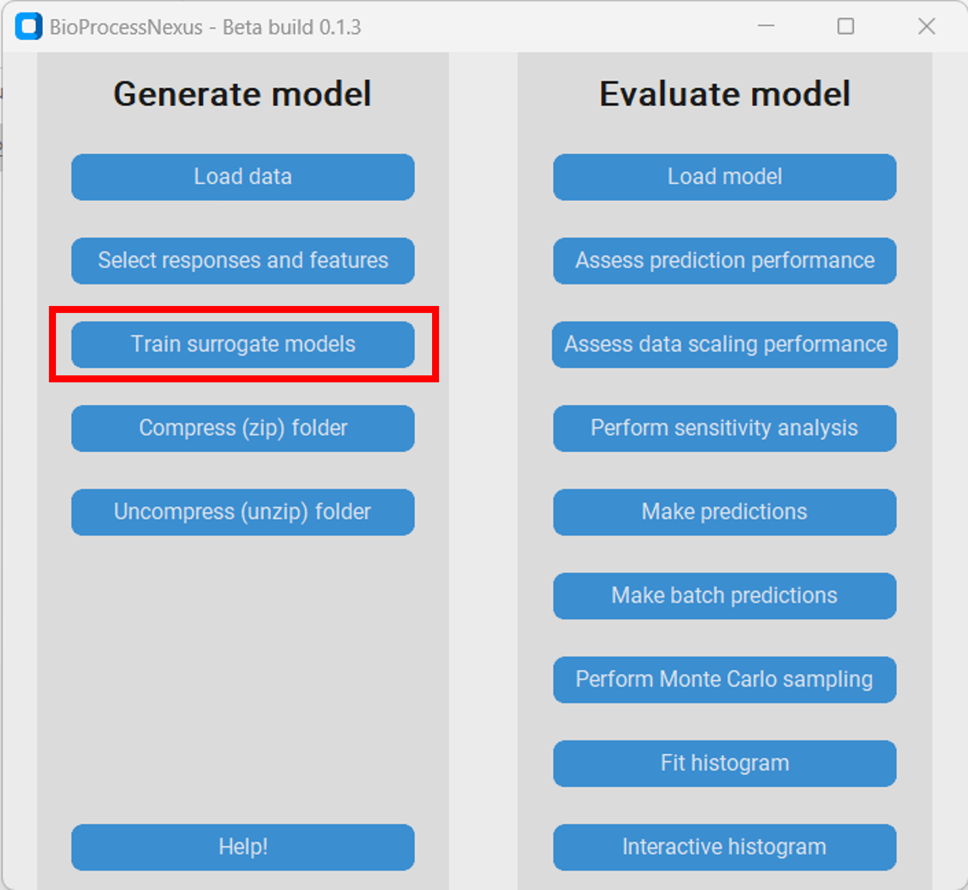
Protein A chromatography
In this tutorial we will showcase how to model and analyse a protein A chromatography process with the BioProcessNexus.
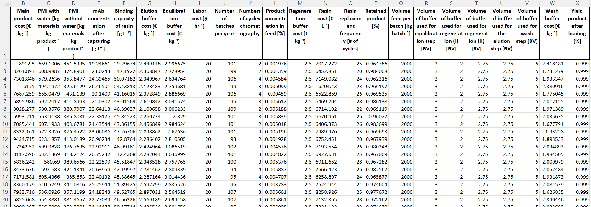
Load Monte-Carlo dataset
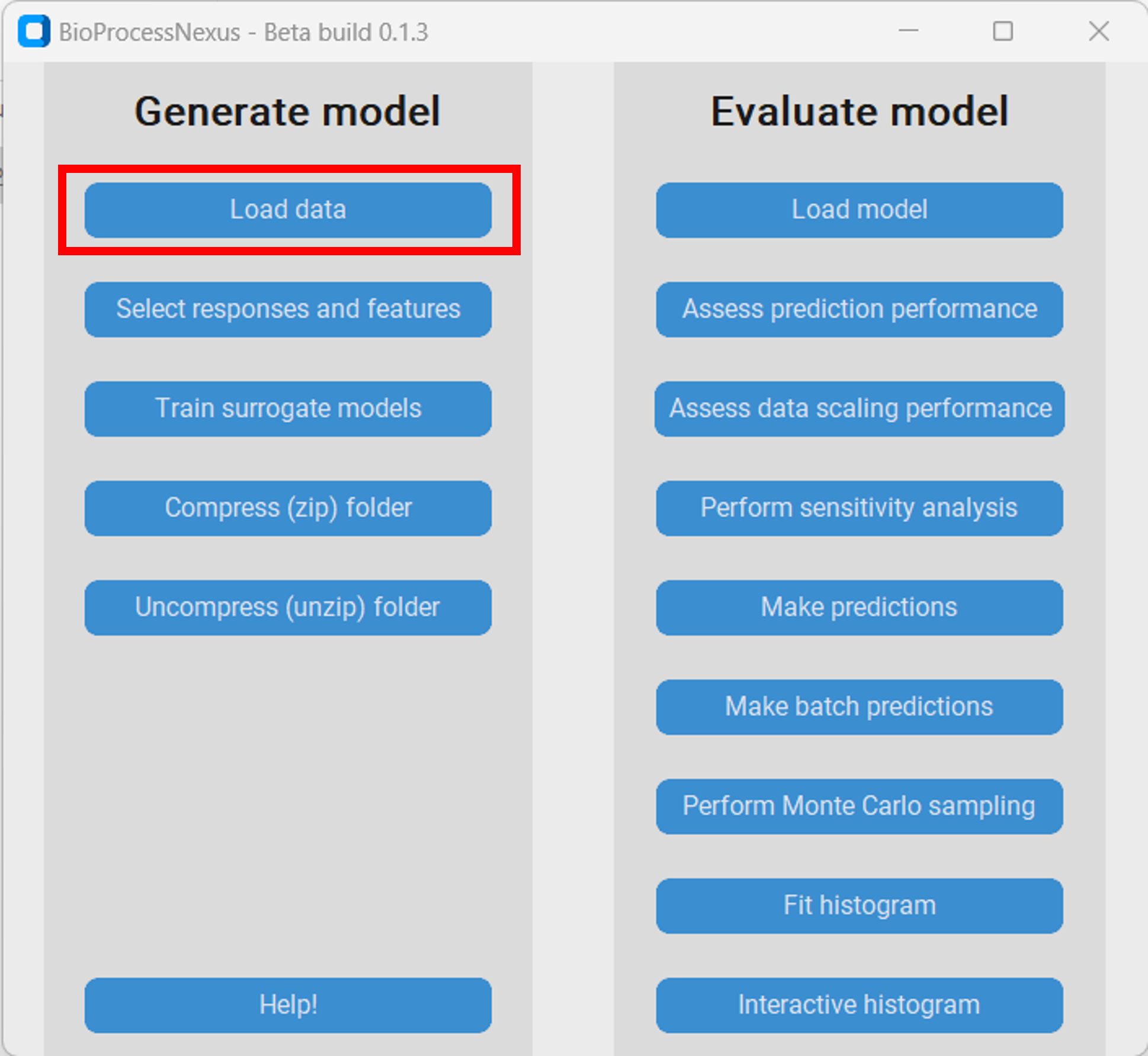
Therefore, we first downlaod the Monte-Carlo file from the Download section and save it in a subdirectory of our choice. Then we open the BioProcessNexus and click on “Load data”.
Response and feature selection
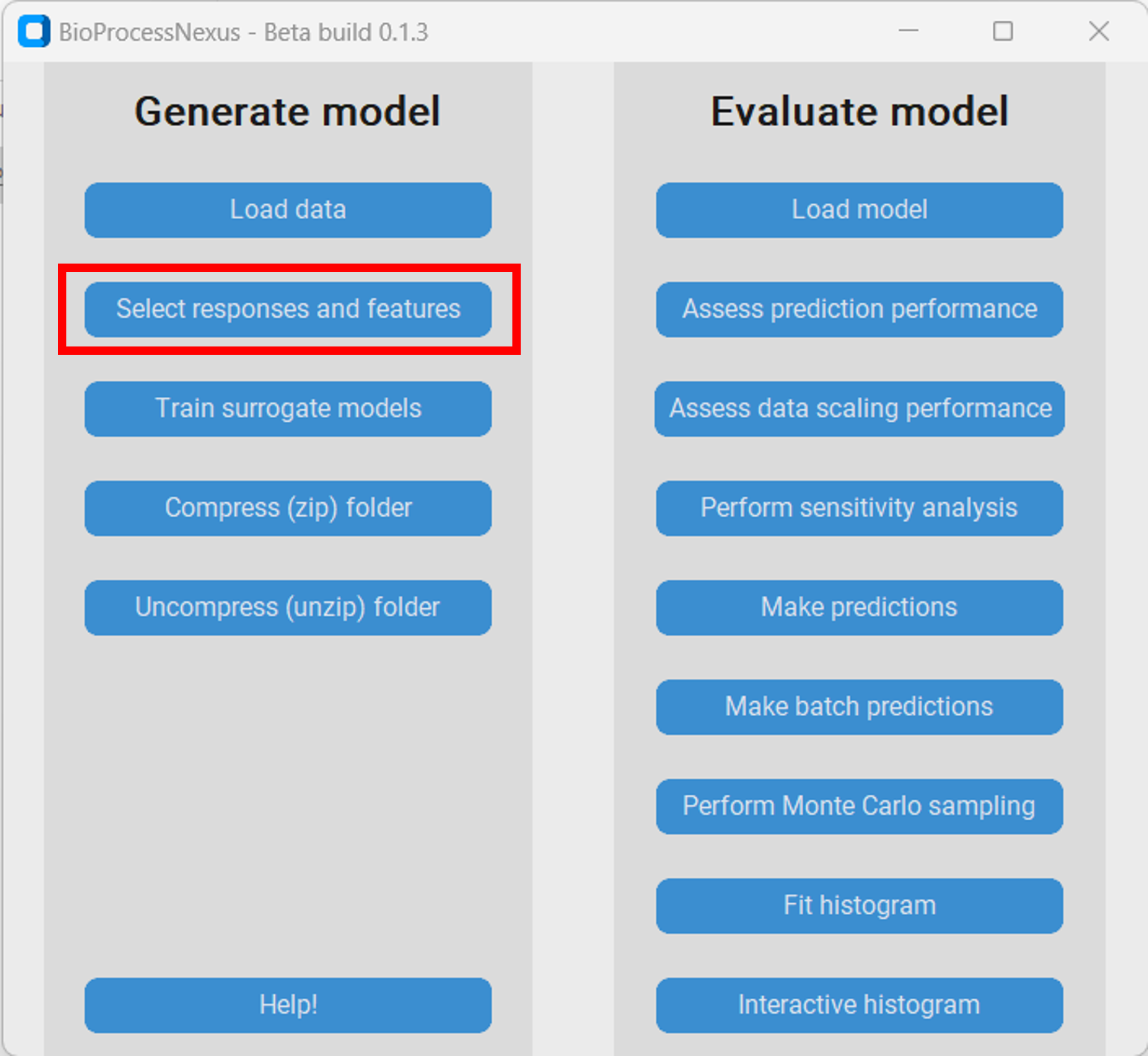
Once we have loaded the raw Monte-Carlo data we have to select the responses and features that we want to model.
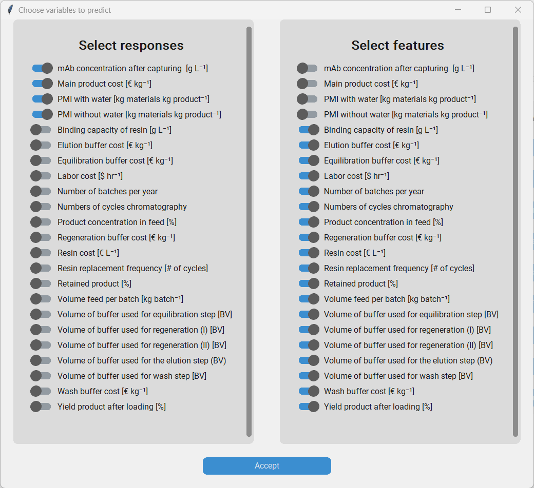
The responses are variables that the model should predict. We choose the following variables as responses:
mAb concentration after capturing Main product cost PMI with water PMI without water
The features are the variables that the model should use to base its predictions on. We choose all the other variables to be our features.
Training and performance evaluation of surrogate models
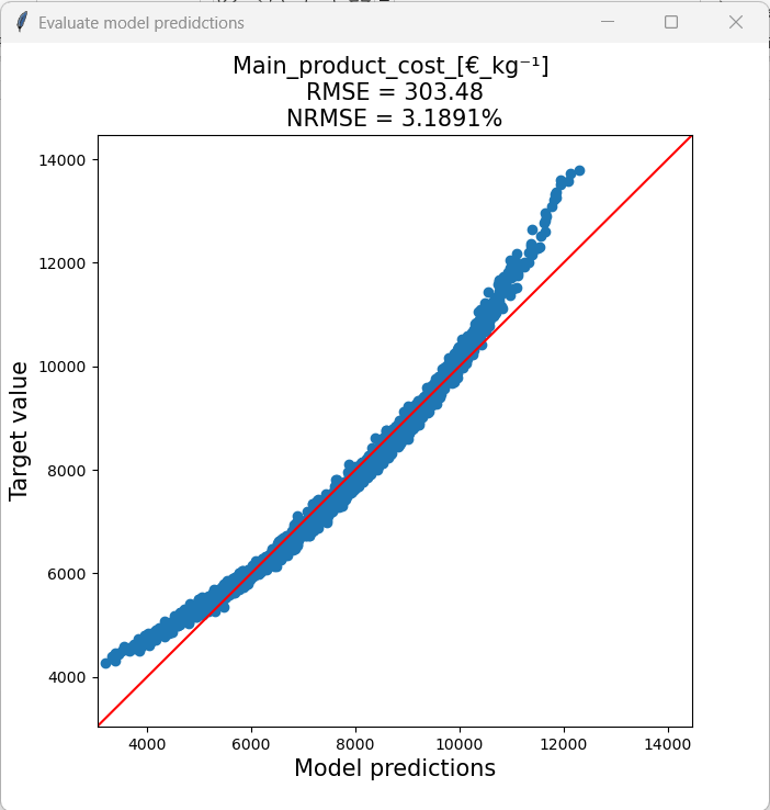
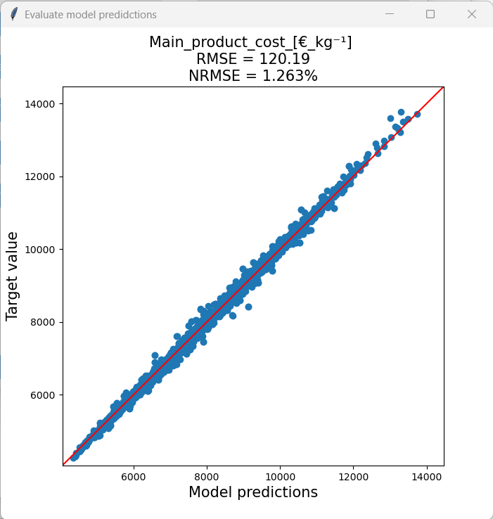
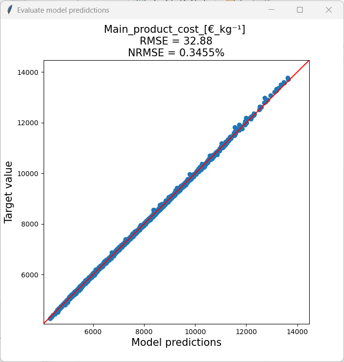
Next we want to generate/train surrogate models capable of predicting the responses based on the features. Therefore, we click “Train surrogate models”, enter a fitting name for the model, and then intiate model training by clicking the corresponding button. Training will take some time and the BioProcessNexus will appear to be stuck (not responsing) during training. This however, is not the case. After a model has been trained we click “Assess prediction performance” to see how well it works. Let´s have a closer look at the Main product cost surrogate models of each type.
Partial least squares (PLS) model
PLS models are very fast to train, don´t require a lot of storage, but often do not perform as well as the other model types.
Model size: 1.004 KB
Training time: < 1 second
Root mean squared error: 303.48 €/kg
Normalized root mean squared error: 3.19 %
Random forest (RF) model
RF models take a longer time to train and the resulting models are larger compared to PLS models, but on the other hand are quite robust and can generally be expected to achieve fairly good prediction accuracies.
Model size: 71.156 KB
Training time: ~32 seconds
Root mean squared error: 120.19 €/kg
Normalized root mean squared error: 1.26 %
Gaussian Process (GP) model
GP models take by far the longest time to train and result in comparatively very large models. This is holds especially true for larger datasets. Additionally, training can sometimes be unstable. However, GP models can achieve very high accuracies with comparatively little data, which makes them a very attractive choice.
Model size: 501.317 KB
Training time: ~20.5 minutes
Root mean squared error: 32.88 €/kg
Normalized root mean squared error: 0.35 %
Comparing the models we can see that PLS model didn´t perform well when predicting datapoints with a very high or very low main product cost. We can see this in the model predictions vs target value plot as the predictions at the extremes are not on the diagonal. That behaviour is problematic as one is often especially interested in minimizing or maximizing a response as much as possible, and when a model is inaccurate at the extremes, model based optimizations it will not work well in these regions.
The RF model generally had a much lower NRMSE and had the same performance throughout the response range. The training time was a little bit longer, but the superior perfomance is definitly worth waiting half a minute longer.
The GP model was by far the most accurate, but it took the longest time to train. In the grand scheme of things, waiting a few minutes, hours or even days is usually worth it considering the impact of improper decision making.
Now we will investigate how well the model performance scales with the size of the dataset. In general, models trained with smaller datasets will be less accurate. To do so we have to load the model we want to analyse by clicking “Load model” and then select the model we want to load in the ~model_linkssubdirectory.
The assessment is initiated by clicking on “Assess data scaling performance”. We will then be asked to enter the number of evaluations that we want to perform. New models of the same type of the loaded model will then be trained with subsets of the original training set and then the model performance of each model on the test set will be evaluated. E.g. if we enter 10 as the number of evaluations, 10 new models with differently sized subets of the original training set will be trained. Therefore, a larger value for the number of evaluations will produce results of a higher resolution, but it will require more computational resources. By clicking “Plot scaling performance” the analysis is initiated. Let´s look at the results for the three model types.
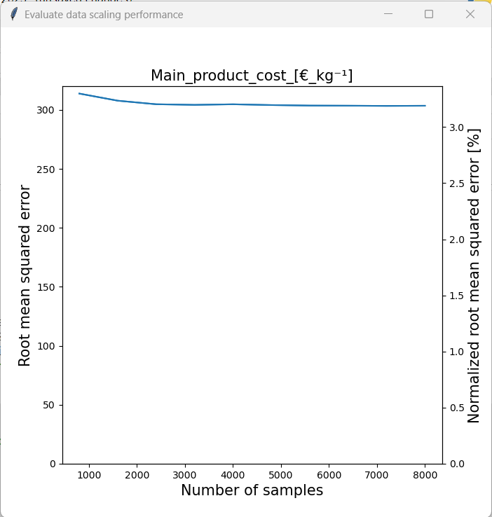
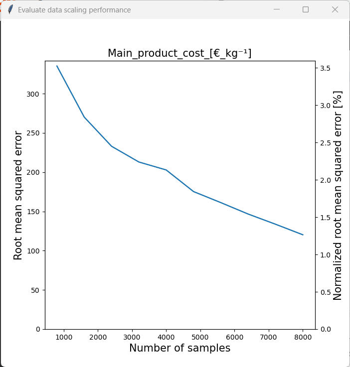
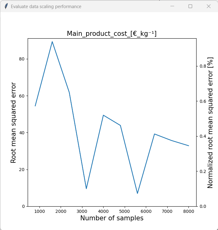
We can see that the model accuracy of the PLS model was barely affected by the sample size. The RF model on the other hand benefited noticably from a larger sample size. As the RMSE was still declining at the maximum samlpe size, we can assume that this trend would continue. Therefore, it would be sensible to generate a larger dataset by performing a more comprehensive Monte Carlo sampling with original model if one wants to use the RF model for further analysis. Finally, the performance of the GPR model generally seemed to increase with sample size. One can also see that training was somewhat unstable, however this is acceptable considering that the model accuracy was generally very high.
As the GPR model achieved the highest test-set accuracy, we will use this model for the rest of the tutorial.
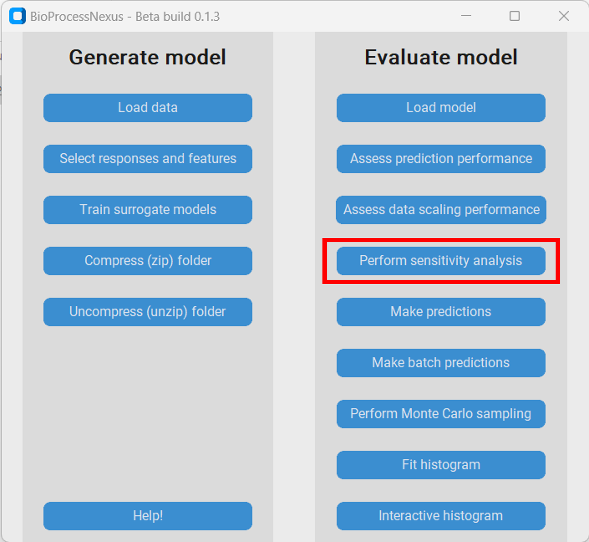
Sensitivity analysis with SHAP
Now that we have amde sure that the model is capable of replicating the prediction behaviour of the original model, we are interested in quantifying the influence of the features on the response. We can do this with SHAP (SHapley Additive exPlanations), which are estimations of Shapley-values. In brief, the Shapley-value is a concept, which stems from game theory that is used to quantify the average marginal contribution of all features across all possible feature combinations/coalations. Consider the scenario where three students enter a competition as a team and win the first place. One can question whether all students contributed equally to the result. The average marginal contribution of each student answers exactly that question. Therefore, the competition is repeated multiple times and each time a different configuration of the three students enters it until all possible configurations have entered it (students a, b and c alone, students a and b together, students b and c together…). With that information we can estimate how much each student contributed to the final result on average over all possible configurations. A more comprehensive explanation of the Shapley-value and SHAP can be found here.
To calculate the SHAP for the loaded model we click on “Perform sensitivity analysis”.
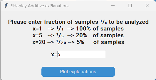
This will result in a pop-up where we are asked to enter the fraction of samples that we want to include in the analysis. This is necessary as SHAP values are calculated individually for each analysed datapoint, and calculating them for the entire dataset is computationally intensive and in most cases won´t provide additional insight. We want to cacluate the SHAP values for 20% of all datapoints in our dataset and therefore enter 5 for x and click on “Plot explanations”. This might take some time depending on the chosen model and number of analysed samples!
Let´s have a look at the resulting plot. The features are ranked based on their estimated average marginal contribution with the most important features being on top. We can see that the “Binding capacity of resin”, “Resin replacement frequency” and the “Resin cost” were the three most important features, while the “Number of cycles chromatography”, “Volume of buffer used for equilibration step”, and “Number of batches per year” were the three least important features. Each dot in the plot represents one datapoint. Datapoints with negative SHAP values are on the left hand side, while datapoints with large SHAP values are on the right. Datapoints with large values of the corresponding feature are colored in red, while datapoints with low values of that feature are colored in blue. Let´s have a closer look at the feature “Binding capacity of resin”. The left most datapoint has a SHAP value around -1800 and is colored in red. That means that that datapoint has a large “Binding capacity of resin” and resulted in a reduction of the “Main product cost”. As the SHAP values are in the same unit as the response, we can deduce that the extent of the “Main product cost” reduction (or more precisely the estimated average marginal contribution) was 1800€/kg compared to the average “Main product cost” across the dataset. On the other extreme we can see a datapoint, which has a very low “Binding capacity of resin” with a SHAP value of roughly 2200, meaning that the low “Binding capacity of resin” of that datapoint led to in increase in the “Main product cost”. All other datapoints fall somwhere in between that. If we now look at the feature “Number of batches per year” we can see that all datapoints have a SHAP value of 0. In other words, the “Number of batches per year” basically had no influence on the “Main product cost” at all.
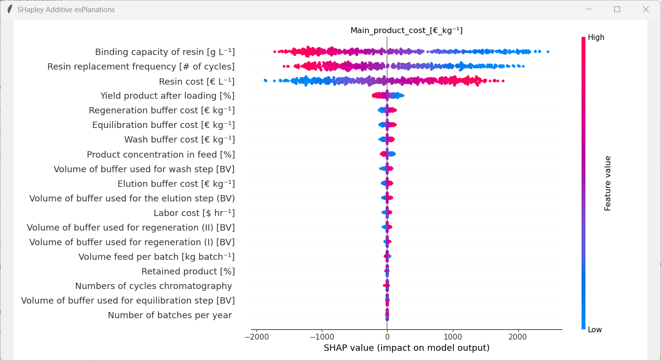
Using this analysis, we always have to remember that the extent of the influence of each feature is closely tied to the analysed dataset and model specifically. Therefore, the assumptions of the original model and Monte-Carlo sampling have to be considered for the interpretation of the plot. For instance, the boundaries that were set for each feature have an enormous impact on the SHAP values. If for example the range of the “Labor cost” were increased from 15$/h-25$/h to 100$/h-300$/h the influence of that parameter would definitly be affected by that. Thus, the general statement “The labor cost isn´t an important feature for protein A chromatography processes” is wrong. It only isn´t an important feature considering not only it´s sampling distribution, but also the sampling distribution of all other features.
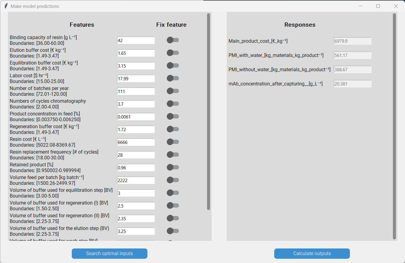
Predicting with the surrogate model
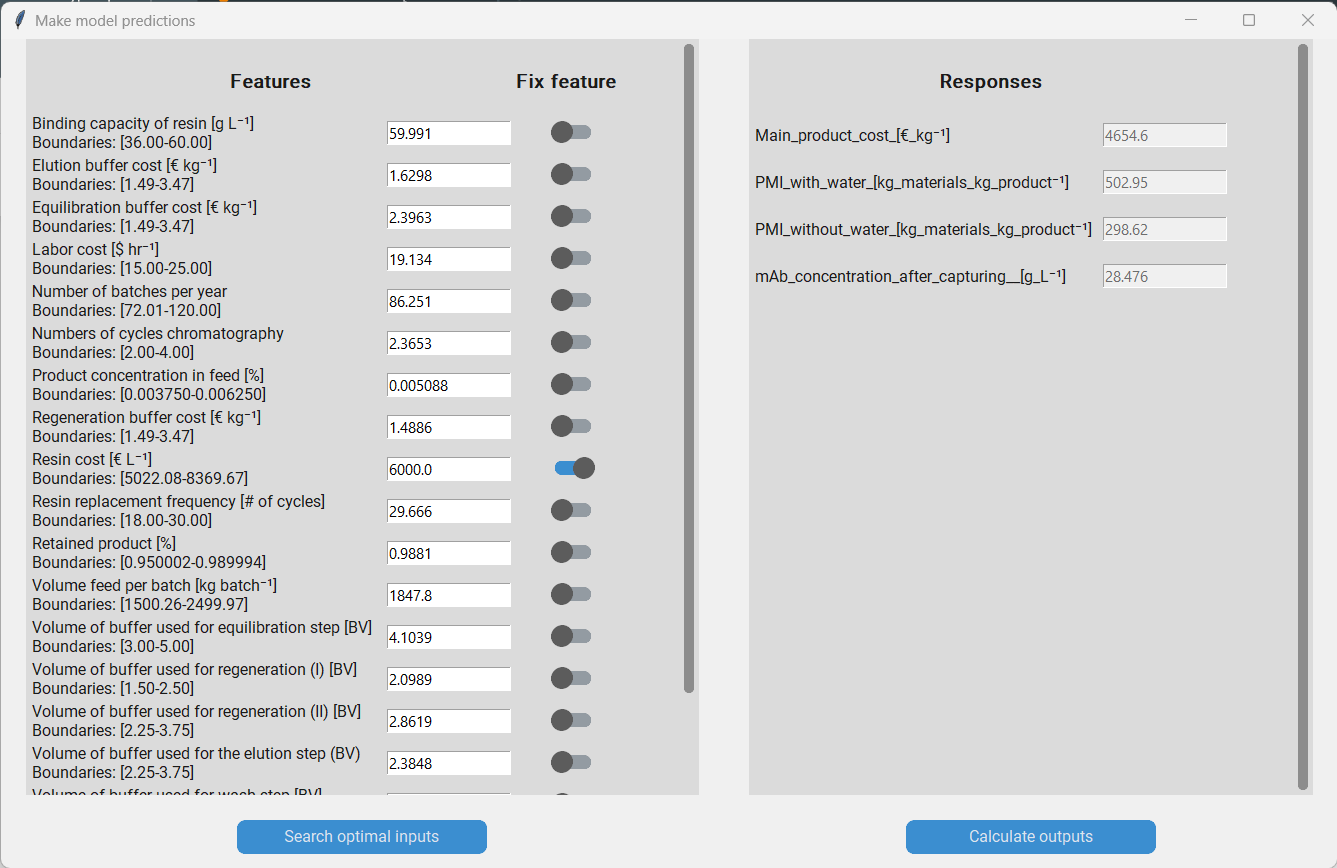
Now that we have an idea what the most influential features are, we might be interested in using the model to predict the responses based on specific values for our features. Therefore, we click on “Make predictions”, which will produce a pop-up that allows us to do so. On the left hand side we have a list with all features and on the right we have a list of the responses. To predict the responses we simply enter the feature values that we are interested in and click on “Calculate outputs”.
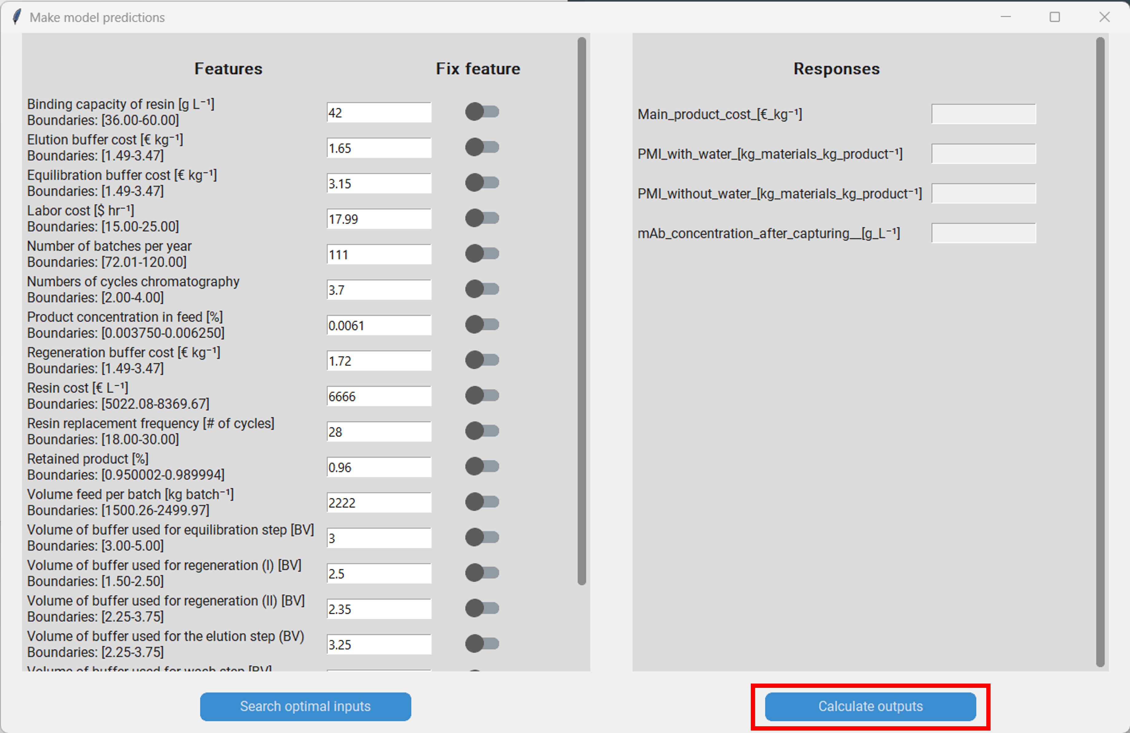
When making predictions we have to be careful that we don´t enter feature values that are outside of the boundaries of each feature respectively. The model accuracy will decrease noticably when feature values outside of the boundaries are used for prediction! For example, when we enter the value of the “Binding capacity of resin” we have to make sure that it lies between 36 g/L and 60 g/L.
Process optimization
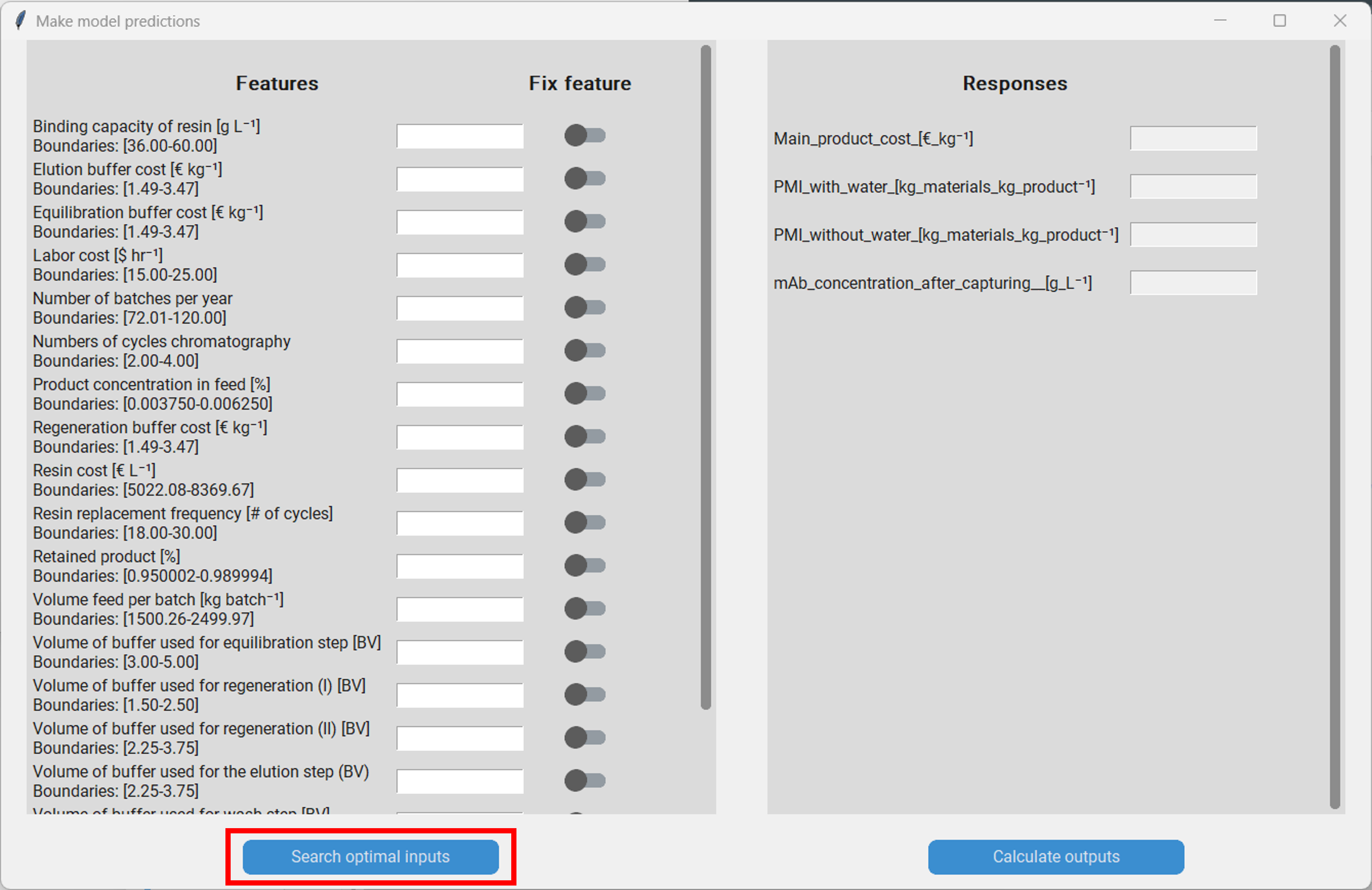
In addition to predicting the responses under a certrain setting, we can also optimize the process using Bayesian optimization. Therefore, we click on “Search optimal inputs” in the “Make model predictions” pop-up, which will spawn another pop-up. Here we have to set a few parameters of the optimization algorithm.
The number of iterations of the optimizer: A small number of iterations will result in a quick result, but the found optimium might be suboptimal. A large one will take unnecessarily long, but will probably result in a better solution. The optimal number of iterations is dependant on the complexity of the problem. We set this to 1000.
The weights for the responses: Each response has a corresponding weight that can be entered directly into the text box or be chosen with the slider. If a response has a large weight, the optimizer will prioritize optimizing that response. A weight of 0 results in the optimizer not taking that response into account at all. For the final optimization, only the relative magnitude between the weights matters; e.g. when all responses have the same weight they will be considerd equally, irrespective whether their value is 1 or 10. Let´s say we are most interested in the “Main product cost”, but don´t want to ignore the other responses completely. Then we can for instance set the weight of the “Main product cost” to 8 and the other weights to 3.
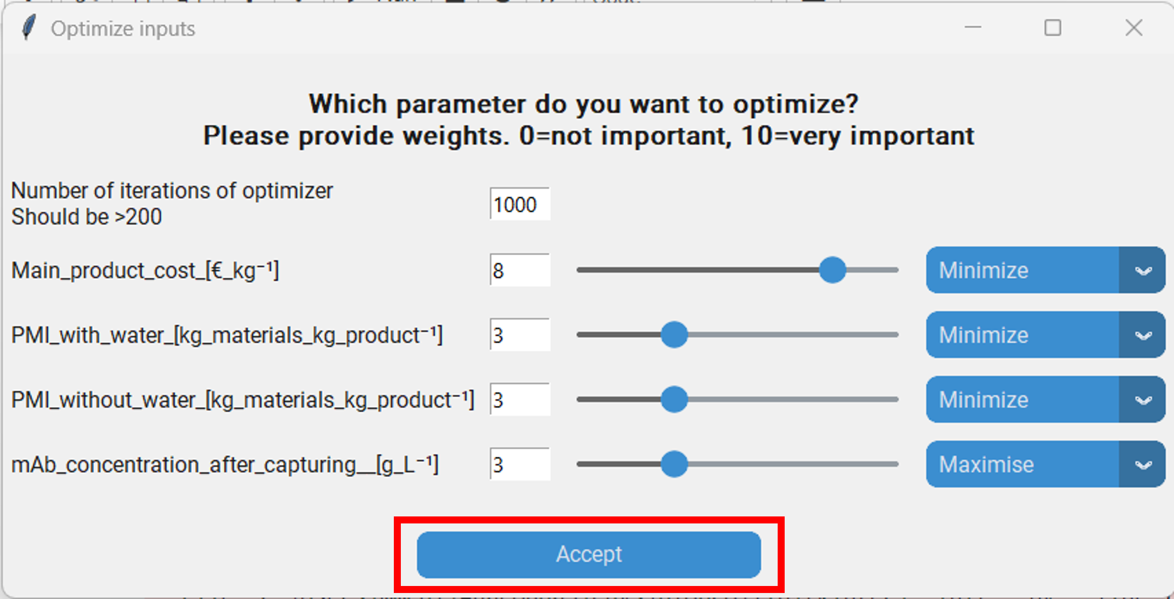
Whether the optimizer should maximize or minimize the features for a response. We want to minimize the “Main product cost”, “PMI with water” and “PMI without water”, while maximzing the “mAb concentration after capturing”.
Optional: Whether a feature should be fixed to a specified value. This might be interest when there are features in our dataset that we are certain won´t change. For instance the “Resin cost” might be fixed due to an preexisting agreement with the supplier. Therefore optimizing it won´t help us as we couldn´t change it even if we wanted to. Let´s say we want to fix it at 6000 €/L. Then we go to the “Make model predictions” pop-up, enter that value and click on the switch in the row that says “Resin cost”.
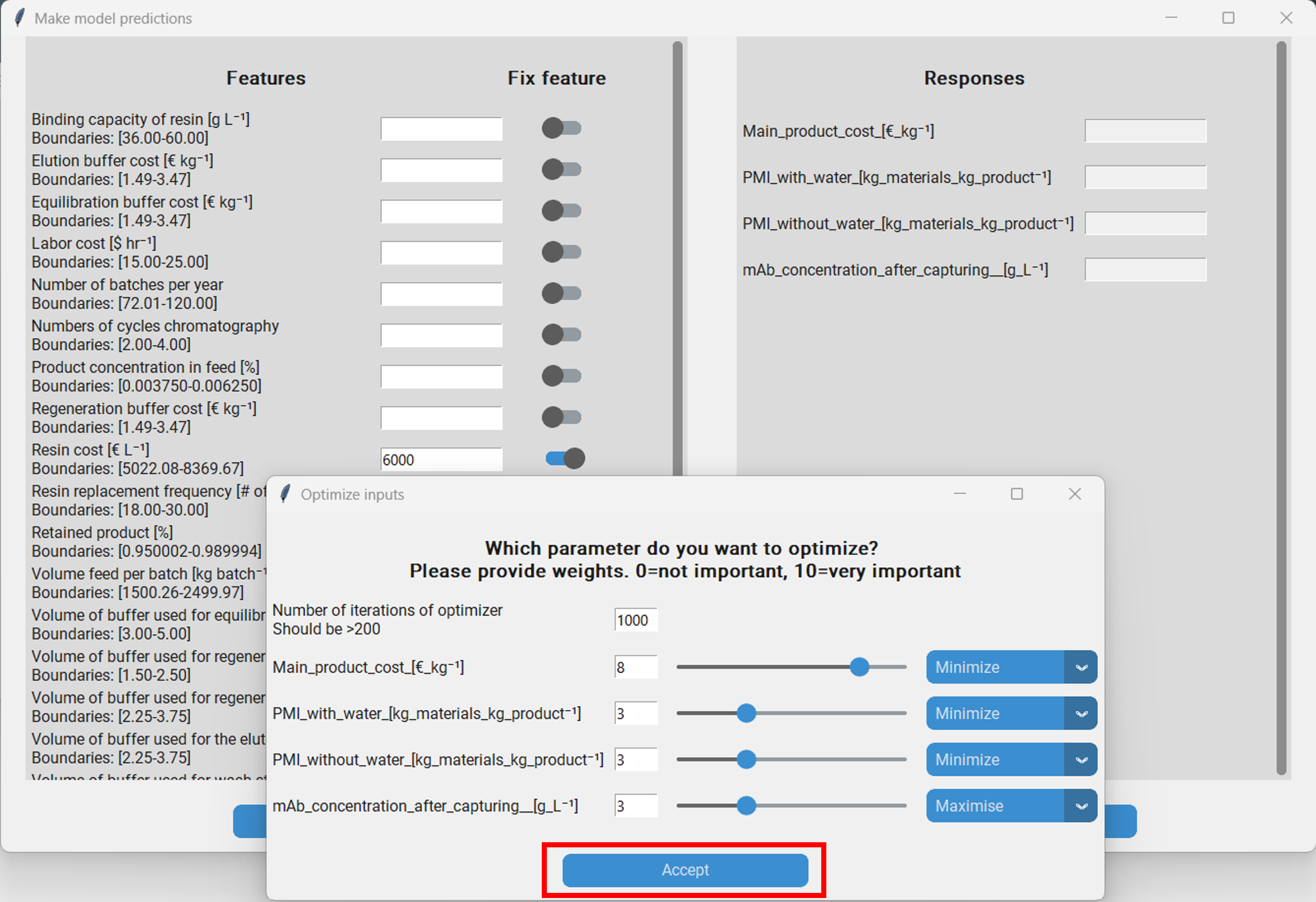
Once we have parameterized the optimizer we can launch it by clicking on “Accept” in the “Optimize inputs” pop-up. After the optimizer has finished, the found feature values are automatically entered in the entry boxes of the “Make model predictions” pop-up. Addtionally, a log is saved under ~logsmodel_nameoptimization_logsmm_dd_yyyy_hh_mm.txt. Then we can let the model predict the responses with the optimized features to assess how well the optimization worked.
But what did just happen? We have performed Bayesian optimization with a Tree-Parzen-Estimator as implemeted in Hyperopt. The algorithm was originally used to optimize the hyperparameters of machine learning models, however it can generally be used to search the optimal values for a set of parameters to minimize or maximize the output of any given function that takes the parameters as input. Thus, we can also use the Tree-Parzen-Estimator to search the optimal values of the inputs of our surrogate models to minimize or maximize the responses. In brief, the Tree-Parzen-Estimator initally samples random values for each of the features and then uses the surrogate model to predict the responses. Then a normalized weighted sum of the responses is calculated and stored. This porcess is reapeated a few times. Then, Parzen-Estimators are used to model the relationship between the features and the weighted sum of the responses. For the remaining itations, the features are not sampled randomly, but based on the Parzen-Estimators.
Batch predictions
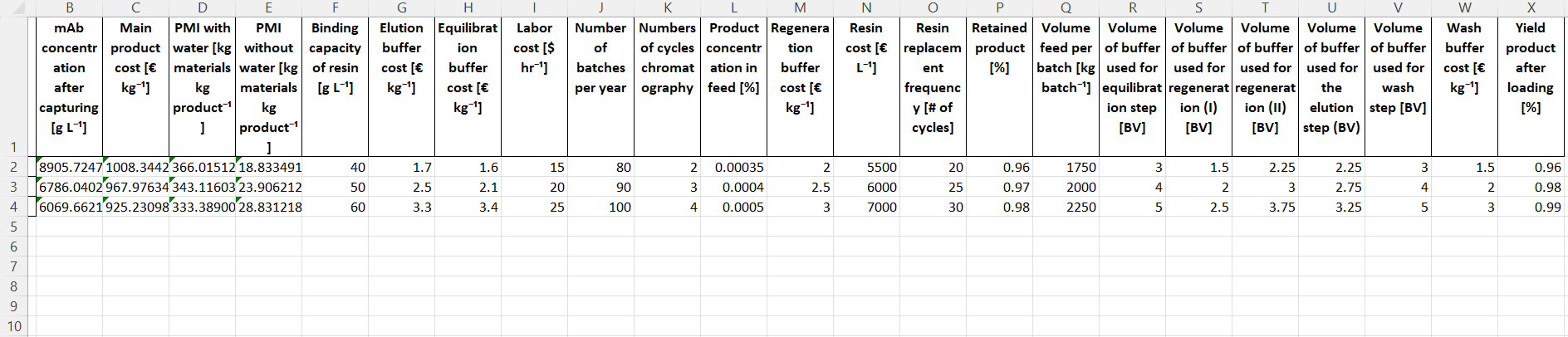
The prediction interface described earlier is useful for computing the responses at specific settings. It, however, can be cumbersome to use it when one wants to make predictions at multiple different settings. For that it is recommendet to use the “Make batch predictions” funciton. Therefore, we click on “Make batch predictions”, which produces a pop-up. Then we generate a tempalte by clicking “Generate template”. The tamplate will be saved at ~/data/model_name/batch_pred_template.xlsx. It contains all the features required for computation of the response.
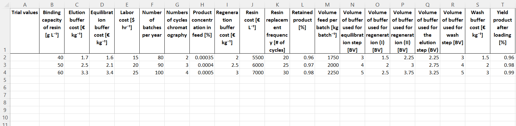
Then we manually enter the settings we are interested in into the table. Once all settings have been entered we return to the BioProcessNexus and click on “Make batch predictions”, which will open up a file browser with which we select the file containing the settings. Then the predictions will be made and a .xlsx file containing the features and responses will be saved at the same location of the template.
Monte Carlo sampling the surrogate model
The distributions of the features and responses of the used dataset can have large influence on some statisical analysis. In case of the BioProcessNexus, this concerns the histograms and interactive histograms. Datasets supported by the BioProcessNexus have a uniform distribution of features as this is beneficial for model training. This, however, is not representative of real world settings and will in consequence distort histograms based on these datasets. To improve this it is highly recommended to perform a Monte Carlos sampling with more realistic feature distributions. We have two options to do that. We can either use the original model or a surrogate model. In this tutorial we will use the Gaussian process surrogate model that we trained earlier.
To do so we press “Perform Monte Carlo sampling”. In the pop-up we can see a list of all features and besides them some options for the distribution we want to sample from.
Type of distribution: Here we can choose the type of the distribution that we want to sample the feature from. The options are a) “Fixed value” if we want to keep a value constant, b) “Gaussian distribution” if we want to sample from a Gaussian distribution parameterized by its mean and standard deviation, c) “Truncated Gaussian distribution” if we want to sample from a Gaussian, but prevent values outside of the chosen boundaries (e.g. if we want to avoid unfeasable values and extrapolation), d) “Triangular distribution” if we want to sample from a triangular distribution parameterized by its lower bound, mode and upper bound and e) “Uniform distribution” if we want to sample from a uniform distribution that is parameterized by its upper and lower bound.
Number type: Here we choose wheather we want to sample real numbers or integers. This is useful to avoid values with decimals where they don´t make sense (e.g. a value of 42.666 doesn´t make sense for the “Number of batches per year”).
Parameters 1-4: These are the parameters for defining the chosen distribution. Depeding on the chosen distribution one or more parameters have to be set. When a parameter has to be set the corresponding textbox will turn white and the name of the required parameter will be written in that box in light grey.
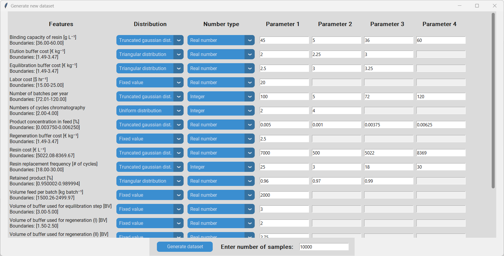
Once all distributions have been fully defined we have to enter the number of samples in the textbox at the bottom. Depending on the complexity of the distributions more or less are needed, however, it is recommended to sample at least 10000 datapoints. By clicking “Generate dataset” we perform the Monte Carlo sampling and save the resulting dataset at to location of the original dataset.
Histograms
The histogram is a valuable tool to visualize the distributions of the responses. We can use it to get an idea how likely certrain scenarios are and use that infomation for risk managment.
To investigate the distributions of the responses of the newly generated dataset, we load it with “Load data”, select the features we are interested in with “Select responses and features” and proceed by clicking “Fit histogram”. This will produce a histogram for each of the selected responses. Additionally, a probability distribution is fitted to the data using the distfit package. The exact parameters of the fitted distributions can be found under ~/logs/no_model_mm_dd_yyy_hh_mm/response_name/histogram_parameters.txt and the plots are saved at ~/images/no_model_mm_dd_yyy_hh_mm/response_name/histogram.png.
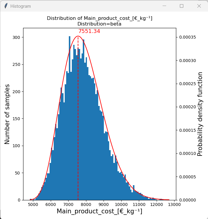
When we look at the histogram of the “Main product cost” we can see that a beta distribution fits the histogram well. The mode of the distribution is 7551.34, which is the most likley “Main product cost” to occur under the given assumptions. We can also see that the distribution is skewed towards the upper end and that the “Main product cost” is between 5000 €/kg and 12500 €/kg. Additionally, we can integrate over the probability density function of the fitted distribution to estimate the likelihood of an event between two boundaries of occuring. This will be done in the next section.
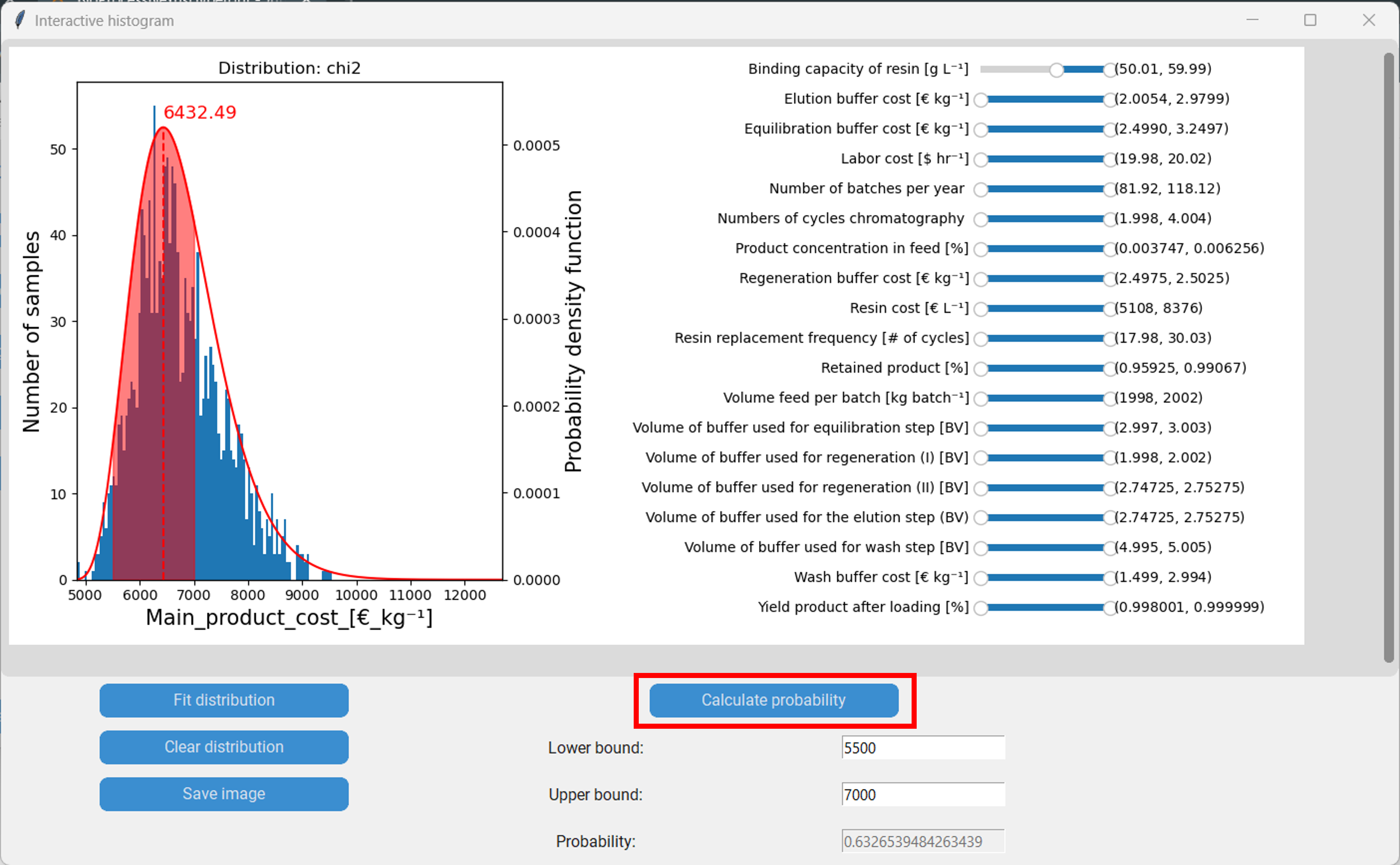
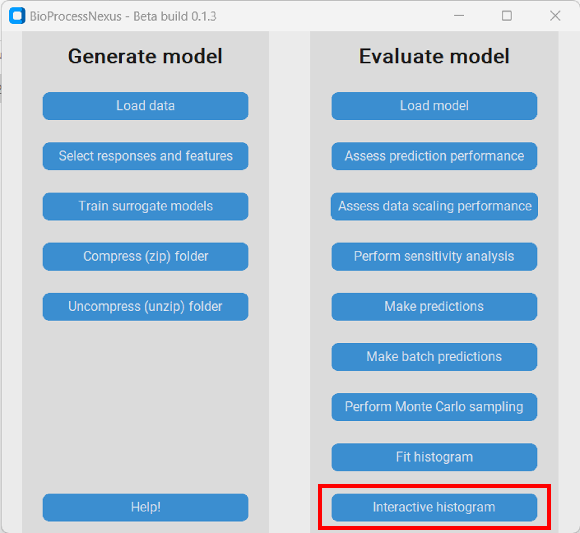
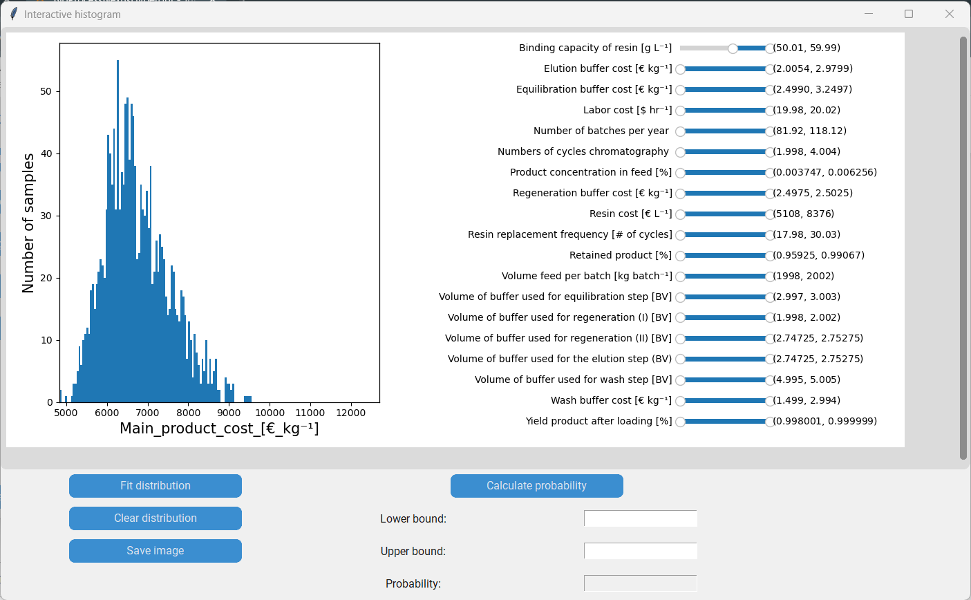
Interactive histograms
The interactive histogram is an extention of the histogram that enables additional methods of analysis. To spawn it we first have to press on “Interactive histogram” and then on the button with the response we want to investigate, in our case the “Main product cost”.
In the new window we can see the histogram of the main product cost on the left and the featuers with sliders on the right. The values within the brackets on the right side of the sliders indicate the lower and upper boundaries of the corresponding feature. By moving the sliders we can move the boundaries of the features, which in consequence removes datapoints with feature values outside of the boundaries from the histogram.
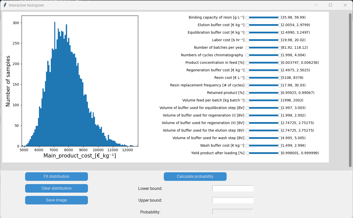
For instance by moving the lower boundary of the “Binding capacity of resin” to 50 g/L we (temporarily) remove all datapoints with a binding capacity lower than that. We can see how that change shifts the distribution of the main product cost to the left.
We can now fit a probability distribution to the new histogram by clicking “Fit distribution”.
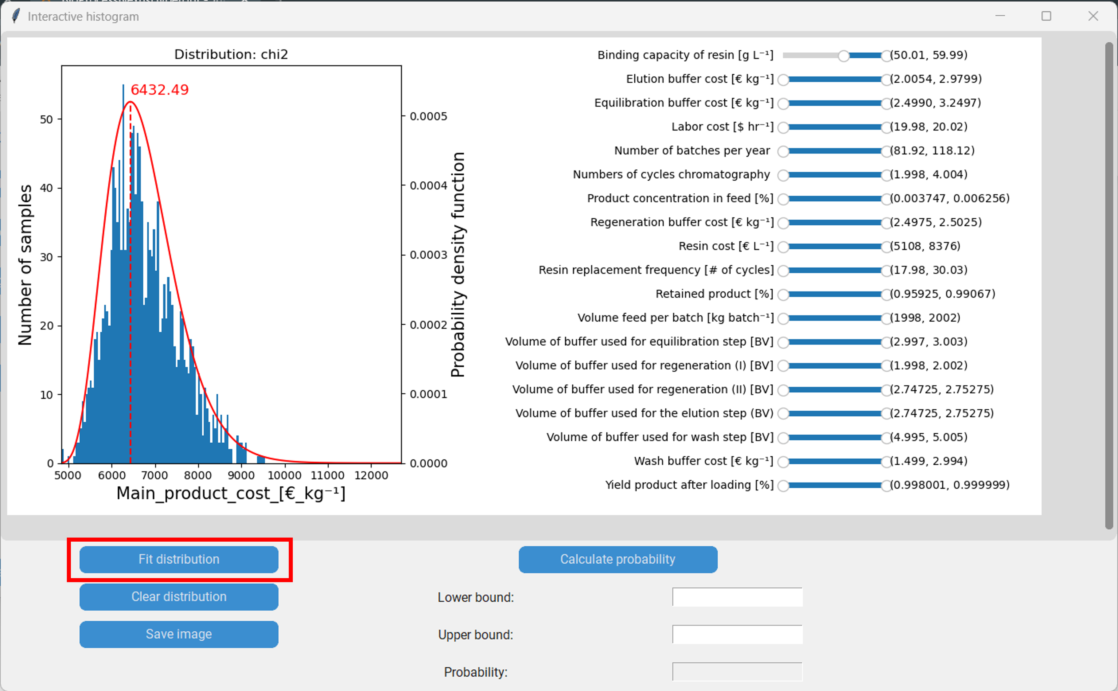
Furthermore, we can calculate the probability of an event between two boundaries of happening by integrating the probability distribution. Let´s say we are interested in the main product cost being between 5500 €/kg and 7000 €/kg. We then enter 5500 as the lower boundary, 7000 as the upper boundary and proceed by clicking “Calculate probability”. In our case the probability is 63.27%. Finally, we can save the plot, including the sliders, by clicking “Save image”.